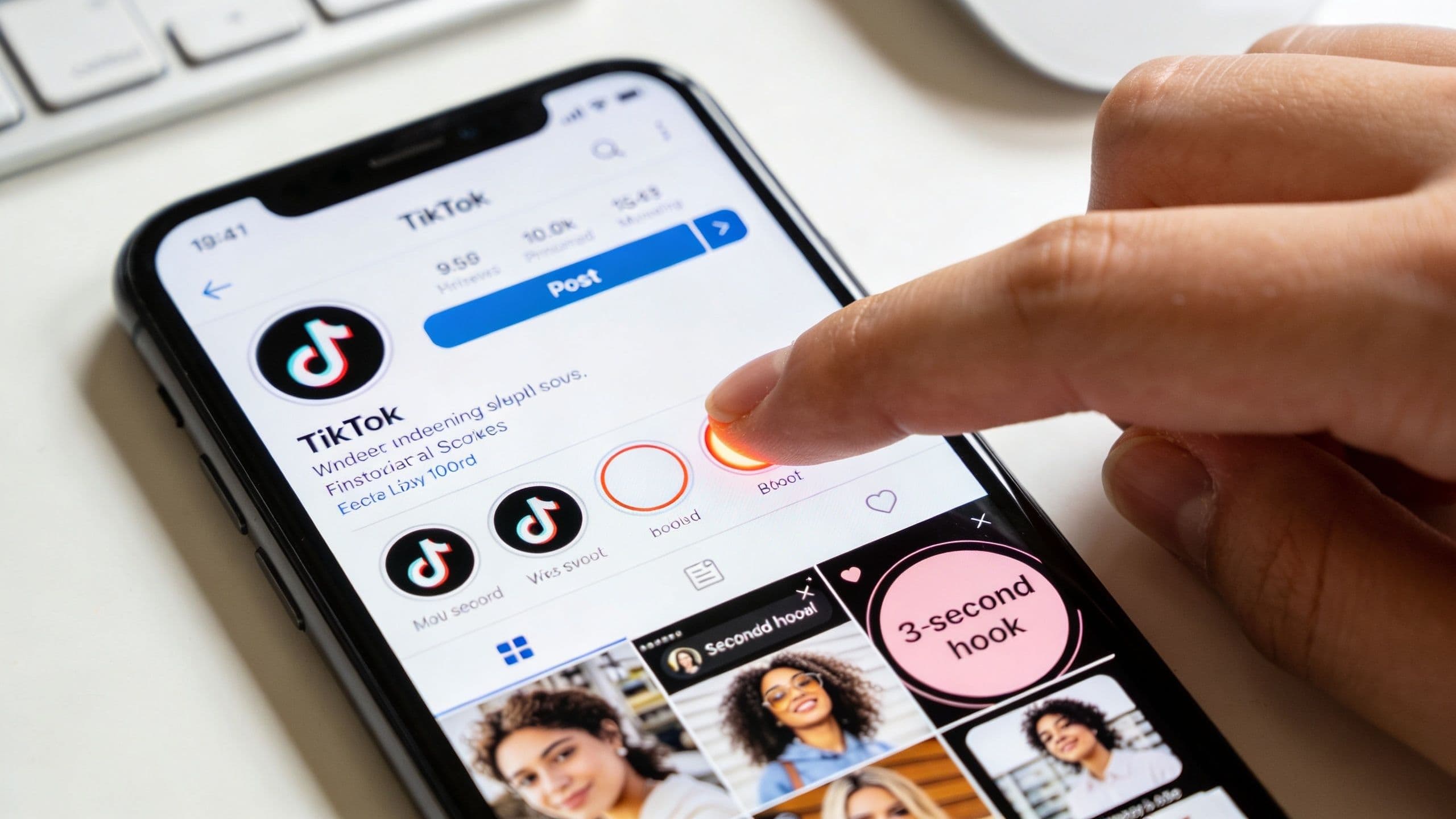
Most creators treat the tiktok green screen video effect like a novelty. That's a mistake.
The format has shown a 31% increase in video reach compared to content without visual effects, according to 2025 performance statistics on TikTok green screen effect performance. That matters because reach is the bottleneck. If TikTok gives your video more distribution, your hook, editing, and offer get a chance to work.
The bigger shift in 2026 is workflow. Basic tutorials still teach where to tap. Serious creators care about something else: picking the right background, filming clean edges, editing with intent, and reading the analytics without fooling themselves. That's where green screen stops being a gimmick and starts acting like a real creator advantage.
Green screen works best when it carries meaning on frame in the first second. The winning move is not fake travel or random novelty. It is faster comprehension.
A plain talking-head video makes viewers assemble the story themselves. A strong green screen post puts the proof behind you right away: the headline you are reacting to, the product result you are showing, the screenshot that starts the argument, the receipt that makes people stay. As noted earlier, creators using the effect often see stronger distribution. In practice, the bigger advantage is simpler than reach. People understand the premise faster, so more of them keep watching.
That speed matters.
TikTok gives you a tiny window to earn attention, and green screen lets one frame do two jobs at once. Your face delivers emotion and authority. The background delivers context. That combination is why I keep coming back to the format for commentary, product education, and quick story setups that would otherwise need multiple cuts.
The trade-off is clarity. A busy background kills retention just as fast as a boring one. If viewers are reading tiny text, trying to decode a cluttered screenshot, or watching motion that competes with your face, the effect stops helping. It becomes visual noise.
Use this rule before you hit record:
Practical rule: If the background does not sharpen the point in under a second, replace it.
The highest-performing green screen concepts usually fit one of four jobs:
This is also where workflow starts separating casual creators from serious ones. Strong green screen posts are rarely improvised in-app from scratch. I use Trendy first to spot what format is already getting attention in my niche, then map a background that matches the angle instead of guessing. That saves time and cuts one of the biggest mistakes creators make in 2026: filming a decent take around a weak visual premise.
If you want a broader breakdown of why some posts spread and others stall, Viral.new's guide on TikTok growth is useful. For the repeatable side of the process, this guide to going viral on TikTok pairs well with a green screen strategy.
For small creators, that is the primary advantage. Green screen gives you production range, clearer storytelling, and faster testing, without renting locations, building sets, or waiting on a bigger budget.
A bad green screen post usually goes wrong before filming starts. The idea is vague, the background is random, and the creator hopes editing will save it.
It won't.
The background decides the role your video is going to play. I think of it as choosing between clarity and energy.
Here's the trade-off:
| Background type | Best use | What works | What usually fails |
| Static image | Tutorials, reactions, explainers | Clear screenshots, bold text, simple compositions | Busy screenshots with tiny text |
| Video background | Storytelling, vibe-heavy posts, product scenes | Motion that supports your point | Motion that competes with your face |
| Screenshot carousel style | List posts, commentary, receipts | One visual per talking point | Too many references in one frame |
Static images are easier to control. If you're explaining a concept, reacting to a post, or teaching steps, start there. Video backgrounds can feel more dynamic, but they demand discipline. If there's motion behind you, it needs to support the script, not hijack attention.
The strongest tiktok green screen video ideas usually fit one sentence:
If you can't explain the concept in one line, the video is probably trying to do too much.
Your audience doesn't need a clever effect. They need a reason to care about the thing behind you.
A weekly plan helps more than inspiration ever will. Batch a handful of backgrounds into folders on your phone. Keep separate albums for screenshots, memes, product shots, article headlines, customer questions, and before-and-after visuals. When you sit down to film, you want fast choices, not scavenger hunts.
If you want a planning framework for batching these ideas, this TikTok content calendar template gives you a clean way to organize formats by day and purpose.
A lot of creators delay posting because they think they need a newer setup first. In reality, a stable camera, clean lens, and decent front-facing performance matter more than hype. If you are shopping for an upgrade, this roundup of best iPhone deals UK is useful because refurbished models often hit the sweet spot for creators who want strong video quality without overspending.
Later, when you want a quick visual walkthrough of green screen setup, this clip is a good reference point:
Most creators don't need one at first. TikTok's built-in effect is enough for commentary, list posts, tutorials, and meme formats.
A physical green sheet becomes useful when you:
If you're still testing the format, skip the extra gear. Put your effort into script clarity and background choice. That's where the payoff starts.
The fastest way to ruin a good concept is to film it in bad light. You know the look. Jagged shoulders, flickering edges, weird halos around your hair, and that floating-outline effect whenever you move.
That isn't a creativity problem. It's a setup problem.
A Reddit analysis of r/TikTok found that 42% of complaints centered on “choppy edges” or “ghosting” during movement, and one of the key fixes was proper lighting, including a key light at a 45° angle with a 5600K color temperature.
You don't need a studio. You need separation and consistency.
Use this room-by-room approach:
If all you've got is daylight, face the window and avoid mixed lighting from overhead bulbs. Mixed color temperatures make skin tones and edge detection look rough fast.
I see this mistake constantly. Someone stands too far back, films full body for no reason, and then wonders why the cutout looks messy.
For most green screen content, upper-body framing is cleaner and more persuasive. Your face is bigger on screen, your gestures read better, and the effect has less work to do around moving limbs. Keep enough space above your head so text or background details can breathe, but not so much that you turn into a tiny figure in your own video.
A green screen post should feel like you're presenting the background, not getting swallowed by it.
Quick hand gestures are fine. Constant swaying, spinning, or stepping side to side usually isn't.
If your edges break when you move, try this:
A practical wardrobe note matters too. Avoid reflective materials, tiny patterns, and anything too close to the background color you're trying to remove later. Solid colors win because they give the effect cleaner boundaries.
Creators often overact because they think green screen demands “big energy.” It doesn't. It demands readable performance.
A steady delivery, clear pauses, and intentional pointing usually outperform frantic movement. If the background is doing its job, you don't need to perform like you're trying to wake up the whole apartment building.
Editing a tiktok green screen video comes down to one question. Do you need speed or control?
If the post is time-sensitive, a reaction, or a simple explainer, TikTok's native editor is often enough. If you need cleaner layers, more accurate background removal, or multiple visual elements, use a pro-level app like CapCut.
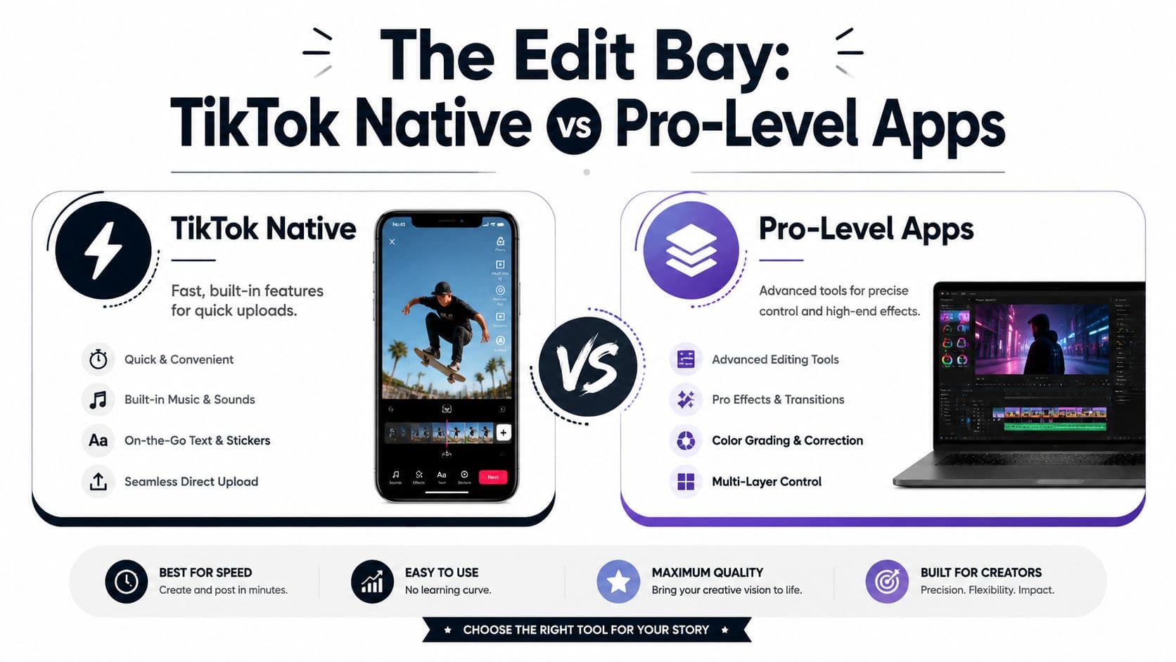
TikTok's built-in green screen tools are fast for:
The native route keeps friction low. You can record, swap the background, reposition yourself, add text, and post without leaving the app. That matters when the idea is hot and speed is part of the advantage.
The downside is precision. If your cutout looks rough or your concept needs layered visuals, native editing runs out of road quickly.
Third-party apps are better when:
CapCut is the usual next step because it gives creators more control without becoming intimidating desktop software. You can stack clips, fine-tune the composition, and recover videos that TikTok's native editor would leave looking half-finished.
A good way to choose is this: if the audience will judge the idea, use TikTok. If they'll judge the finish, use the stronger editor.
For a broader stack of tools beyond just green screen, these TikTok video editing apps are a good reference.
| Workflow | Best for | Strength | Limitation |
| TikTok native | Fast posting | Quick and frictionless | Less precise cleanup |
| CapCut | Polished short-form | More control over layers and cutouts | Takes longer |
| Hybrid workflow | Creators who batch | Clean edit outside, post natively | More steps to manage |
Most creators test captions and posting times but ignore the visual variable. That's a miss.
According to TikTok's Green Screen Video effect announcement and creator analysis details, systematic A/B testing showed average view duration can improve by 20-35% when motion backgrounds align with the content, and comment rates can rise by 15-28% with interactive visuals.
That gives you a practical test idea:
Keep the hook, caption style, and delivery as close as possible. Then compare which version pulled stronger watch behavior and better audience response. This is one of the few edits where a background swap can materially change performance without rewriting the whole post.
Field note: If the moving background is impressive but viewers stop listening to you, the test failed. Motion should support the message, not become the message.
A lot of creators never improve because they treat each post like a random event. Better creators build tiny experiments into the workflow.
Posting is packaging. A mediocre video can get a second chance with strong packaging. A strong video can get buried by weak packaging.
The launch starts with the first line. If the opening sounds like you're warming up, people leave.
Green screen works best when the hook and the background lock together immediately. The viewer should understand both at once.
These hook styles tend to fit the format well:
Weak hooks usually make the background feel random. Strong hooks make the visual feel inevitable.
Too many captions just repeat the script. That wastes the field.
Use the caption to do one of three things:
Examples of useful caption endings:
These don't need to sound clever. They need to make interaction feel easy.
Creators overcomplicate hashtags and underthink audio. For green screen posts, sound matters because it shapes pacing and mood even when the viewer is focused on your face and background.
Use audio that matches the role of the post:
Hashtags should help categorize the content, not turn into a stuffing exercise. A few relevant tags usually beat a cluttered caption full of unrelated trend bait.
If your hook says “expert breakdown” and your audio says “chaotic meme,” the packaging is fighting itself.
Even on TikTok, profile presentation shapes whether someone binge-watches your page. Green screen content often creates excellent thumbnail opportunities because the background can telegraph the topic in one frame.
Choose a cover where:
If you want a deeper breakdown on covers and click behavior, this guide to TikTok thumbnails is practical and easy to apply.
The goal is simple. Your launch package should make the video feel worth watching before the viewer has watched it.
After posting, most creators do one of two useless things. They either obsess over views too early, or they never check the right signals at all.
Views matter, but they don't explain much by themselves. A better read comes from how people behaved once the video appeared in front of them.
When I review a green screen post, I care about a few questions:
Creators need discipline here. Don't rewrite your whole strategy based on one post. Look for patterns across several uploads.
Here's a useful interpretation table:
| Signal | Likely issue or win |
| High views, weak response | Packaging worked, substance didn't |
| Strong watch behavior, low comments | The content was useful but not conversational |
| Lots of shares or saves | The post had practical or emotional value |
| Fast drop-off | Hook, framing, or opening visual missed |
The analytics aren't judging you. They're describing what the audience experienced.
That shift matters. Once you read analytics as feedback instead of validation, your next video gets better faster.
For creators who want a cleaner framework for reading platform signals, this social media analytics tracking guide is a strong starting point.
Success isn't found in a single good post. It's building a loop where every green screen upload teaches you what to change next time.
If you want that feedback loop without manually piecing everything together, Trendy is worth a look. It helps creators turn performance data into next-post decisions, spot patterns in what's working, and plan smarter before they hit record. You can try the iOS app on the App Store or get it on Google Play for Android.
