
You post a Story you’re proud of. Good light. Sharp hook. Cute poll. Maybe even a product tag you felt weirdly confident about.
Then Instagram hands you a pile of numbers: reach, exits, taps forward, taps back, replies. You stare at the screen and think, cool, but what am I supposed to do with this?
That’s where most creators get stuck. They aren’t short on data. They’re short on interpretation. Instagram stories analytics gives you signals, but it doesn’t automatically translate those signals into, “your first slide was weak,” or “this poll kept people watching,” or “your audience liked the topic but hated the pacing.”
Once you learn how to read the behavior behind the metrics, your Stories get a lot less random. You stop posting and hoping. You start spotting patterns.
A lot of creators use Story views like a mood ring.
Views are up, so the content must be good. Views are down, so the algorithm must be rude again. That’s a very human way to react, but it misses the better clues hiding underneath.

One creator posts a “get ready with me” sequence and sees decent reach, but people bail early. Another posts a messy behind-the-scenes Story with lower initial reach, yet followers reply, rewatch, and share it. Which one taught you something useful? Usually the second one.
That’s the shift. Instagram stories analytics isn’t just a scoreboard. It’s audience body language.
If people tap forward fast, they’re telling you to tighten the slide. If they tap back, they’re saying, “wait, I want that again.” If they exit, something broke the flow. If they reply, you hit a nerve.
Practical rule: Stop asking, “Did this Story do well?” Start asking, “What behavior did this Story trigger?”
That’s the lens smart creators use. It turns random posting into pattern recognition.
If you’re still fuzzy on the big picture, this guide to what social media analytics actually means is a useful foundation. Story data makes more sense once you see how it fits into the larger content system.
The fun part is that Story analytics can feel less like homework and more like reading your audience’s mind. Not perfectly, of course. Instagram keeps plenty of mystery in the machine. But there’s still enough signal here to build a serious growth strategy.
Instagram hides useful data behind a few taps, which is very on-brand for Instagram.
If you’ve only checked who viewed your Story, you’ve seen the tip of the iceberg. Greater value lives in Insights, where you can look at performance for a single Story and also review patterns across multiple Stories over time.
For the broad view, open Instagram and go to your profile. From there:
This view helps you zoom out. Instead of reacting to one Story in isolation, you can ask better questions:
You also need the close-up view.
Open an active Story or a recent archived Story where Insights are still available in-app. Swipe up or tap into the analytics area for that specific Story, where Instagram shows the behavior metrics that matter most, like navigation actions and interactions.
For a single Story, focus on what changed from slide to slide.
A useful creator habit is to review Stories in pairs or clusters, not one at a time. If slide one gets attention and slide two loses people, you probably have a transition problem. If a poll slide gets more energy than a talking-head slide, your audience may want to participate, not just watch.
Don’t try to decode everything on day one. Just start collecting patterns.
Use this tiny review routine after each Story run:
Native analytics can feel scattered, but they’re still enough to build good instincts if you review them consistently.
The creators who get the most out of instagram stories analytics aren’t always the most technical. They’re the most observant.
The fastest way to get overwhelmed is to treat every metric like a mystery. Most of them are simpler than they look.
Think of Story metrics as three buckets: how many people saw it, how they moved through it, and how they interacted with it. Once you sort them that way, the dashboard gets much easier to read.
The first bucket is visibility. That’s where reach and impressions live.
The second bucket is movement. That’s your navigation metrics, like taps forward, taps back, exits, and next story taps.
The third bucket is interaction. That includes replies, shares, sticker taps, and accounts engaged.
If you’ve ever mixed up impressions and views, this breakdown of impression vs view helps clean up the language fast.
| Metric | What It Measures | What It Tells You |
| Reach | Unique accounts that saw your Story | How far that Story traveled |
| Impressions | Total views, including repeat views | Whether people may be rewatching or seeing multiple slides |
| Taps Forward | Users skipping to the next slide in your Story | Whether a slide felt too slow, obvious, or low value |
| Taps Back | Users going back to a previous slide | Strong interest, confusion, or a detail worth rewatching |
| Exits | Users leaving your Story entirely | A likely break in relevance, pacing, or interest |
| Next Story Taps |
Reach is your guest list. It tells you how many unique people showed up.
Impressions are seat fills. One person can create more than one impression if they view again or move across multiple Story frames. Reach says how many people entered the room. Impressions say how much watching happened.
Taps Forward are often misunderstood. A tap forward doesn’t always mean “bad.” Sometimes people just watch fast. But when a slide gets skipped aggressively and other signs are weak too, that’s usually feedback about pacing or relevance.
Taps Back are one of my favorite metrics because they often reveal genuine interest. If someone rewinds a slide, they’re telling you it was worth another look. That could mean you packed too much into it, or it was just that good.
Exits are the hard truth metric. They show where people leave your Story entirely. Exits don’t always mean failure. Real life interrupts people. But repeated exits at the same kind of slide usually point to a content issue.
Next Story Taps are similar but slightly different. The viewer didn’t leave Stories as a format. They left your Story and moved to someone else’s. That’s a competitive signal.
Replies matter because they move your Story from passive viewing into direct conversation.
Shares matter because they show social proof. Your audience didn’t just like it. They believed someone else would care too.
Sticker taps are deceptively useful. Polls, quizzes, emoji sliders, and mentions give viewers an easy way to interact without writing a message. That lower-friction action often reveals more than a simple view count.
Accounts engaged helps you separate “people who saw it” from “people who cared enough to do something.”
A Story with lower reach but stronger interaction can teach you more than a Story with high reach and no response.
Completion rate is less about a single slide and more about whether the sequence worked as a sequence.
If the first slide is strong but the middle gets bloated, completion suffers. If the opening is weak, people may never give the rest a chance. That’s why good Story creators think like editors. Every frame has a job.
When you understand these metrics as behavior clues, instagram stories analytics stops feeling technical. It starts feeling practical.
A single metric can mislead you. A pattern usually won’t.
If you only look at reach, you might think a Story performed well because lots of people saw it. If you pair that with exits and next story taps, you may discover people arrived and immediately lost interest. That’s a very different conclusion.
A strong interpretation usually comes from pairing one visibility metric with one behavior metric and one interaction metric.
Here’s what that looks like in practice:
That’s the difference between data and diagnosis.
Let’s make this concrete.
You post a polished product Story. Brand colors are perfect. Text is clean. The first frame reaches people, but the next frame gets skipped and exits rise.
That usually means the packaging was stronger than the payoff. The opening made a promise. The next slide didn’t deliver enough curiosity, clarity, or relevance.
You post a raw talking clip answering a follower question. Reach isn’t your best, but viewers tap back, reply, and share it.
That’s resonance. Maybe not flashy. Definitely useful.
You upload a long set with lots of context, several talking clips, and one random promo slide in the middle. Your early frames do okay, then people disappear.
The issue may not be quality. It may be sequencing. Story viewers are sensitive to momentum. One awkward jump can break the session.
According to Socialinsider’s Instagram Stories analytics analysis, taps back often correlate with 20-30% higher completion rates when intriguing hooks are used early. The same source notes that high exits often show up when slide transitions exceed 15 seconds without an interactive element, causing a 40-50% decay in average reach per subsequent slide. It also notes that replies can signal deeper engagement and boost future Story distribution by 15-30% when you use a clear CTA.
Those details matter because they turn vague advice into cause and effect.
If your audience rewinds a slide, you may have landed on a topic worth turning into a Reel, carousel, or pinned Story concept.
If exits spike after a long static frame, your pacing probably needs work.
If replies rise when you ask a direct question, that’s not just “engagement.” It’s feedback on what kind of invitation your audience responds to.
The best Story creators don’t just review what happened. They identify what likely caused it.
A simple reporting habit helps here. If you want a structure for turning platform data into readable conclusions, this social media analytics report template is a useful reference. It’s easier to spot patterns when you document them the same way each time.
I also like using a lightweight internal framework similar to this social media reporting template. Not because every creator needs a fancy report, but because consistency makes the story in the stats much easier to catch.
Try reviewing each Story run with these prompts:
That’s interpretation. Not “this got views,” but “this opening hook worked, this slide dragged, and this interaction should become part of the next sequence.”
Without benchmarks, creators overreact.
A Story underperforms and you panic. Another does decently and you assume you’ve cracked the code. Usually, neither reaction is accurate. Raw numbers only become useful when you compare them to a known pattern.
The clearest benchmark shift is story count.
According to 2025 Instagram Stories benchmarks from Socialinsider, the optimal range for maximizing reach is between 6 and 13 slides. In that benchmark, reach rises from 6.3% at slide 1 to 37.8% at slide 13, then declines after that point. The same benchmark also notes that video Stories generate higher reach rates than image Stories.
That’s a useful reality check because many creators still assume shorter is always better. Not necessarily. The data suggests viewers will stay with a sequence when the sequence keeps rewarding attention.
The benchmark doesn’t mean “post 13 random slides every day.”
It means there’s a performance window where a well-structured Story set can keep building momentum. If your sequence is repetitive, salesy, or badly paced, adding more slides won’t save it.
The benchmark also shows selectiveness in viewer behavior. The biggest exits tend to happen early, especially in the first few slides. By story 15, exit rates reach about 12.5% in the same benchmark set. That tells you the opening matters a lot, and the back half needs to earn its place.
Use it as a measuring stick, not a rulebook.
Here’s the practical version:
A creator who posts three excellent slides can still outperform a creator who posts twelve sleepy ones. Quality still decides whether people stay.
But benchmarks protect you from false conclusions. If you’ve been treating five slides as the hard ceiling, current data suggests there may be more room to work with. If you’ve been dumping fifteen-plus slides into Stories every day, the benchmark suggests you may be pushing into diminishing returns.
Benchmarks don’t replace judgment. They sharpen it.
That’s what makes instagram stories analytics useful in 2026. You’re not just looking at your own numbers in a vacuum. You’re checking whether your habits line up with how audiences are behaving right now.
Once you know what the metrics mean, the next move is changing what you publish.
Creators often make the process too complicated. You don’t need a grand reinvention. You need a handful of smart adjustments tied directly to what your audience behavior is already telling you.
If people drop off early, your opening slide probably isn’t strong enough.
Try a first frame that creates an information gap. A question. A bold opinion. A visual teaser. A surprising before-and-after. You’re not tricking people into staying. You’re giving them a reason to care about the next slide.
If people skip product slides, don’t hide the product. Reframe the presentation.
Instead of “new product available now,” try:
That kind of framing changes a promo slide from interruption into useful content.
The available public data on Story discovery is still frustratingly thin. As noted by Packsia’s discussion of Instagram Stories analytics gaps, there’s almost no public data on click-through rates from hashtag or location stickers, which makes it hard to know how much discoverability upside those tactics really have.
So don’t build your whole Story strategy on sticker myths.
Build it on what you can observe:
That gives you direct audience feedback instead of relying on platform folklore.
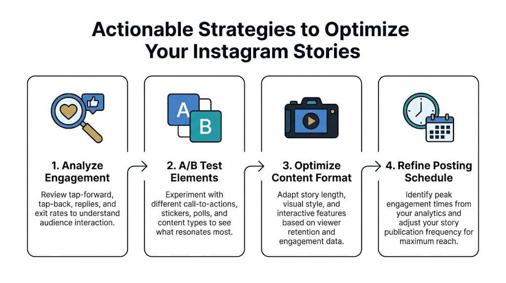
Audit every slide and ask, “if I cut this, does the Story get clearer?” If yes, cut it.
A run of text-heavy slides gets tiring. Mix talking video, screenshots, polls, product close-ups, and simple reaction frames.
If one Q&A slide sparks replies, don’t treat that as a one-off. Build a recurring format around it.
A Story topic with strong taps back may deserve a Reel. If you’re refining short-form video too, this guide on creating high-performing Instagram Reels videos is a solid companion read.
The most practical Story strategy is a running list of tiny experiments.
Try tracking things like:
Treat your Stories like a lab, not a lottery.
You don’t need perfect certainty to improve. You need enough discipline to notice patterns.
If you want more creative prompts to test, this roundup of Instagram Story ideas can help you move from “I need to post something” to “I know exactly what I’m testing today.”
Manual Story analysis works. It also gets old fast.
You post. You review. You screenshot metrics. You forget what happened last week. You try to remember whether your audience liked the opinion slide, the poll, or the demo. Then you post again and hope your memory qualifies as a strategy.
That’s where tools become useful, especially when they reduce interpretation time instead of just dumping more charts on your face.
Native Instagram insights can tell you what happened inside the app. They’re much weaker at connecting Story activity to business outcomes.
That blind spot is the big one. As explained in Practina’s discussion of Instagram Story analytics limitations, the biggest challenge with native analytics is the inability to connect Story metrics to concrete business results like ROI or customer conversions. Most guides stop at content performance, which leaves creators struggling to prove whether a Story drove a valuable result.
That’s a real problem if you sell offers, run a brand account, or manage content for clients. Views are nice. Revenue is nicer.
A useful AI growth tool shouldn’t just tell you that your Story had exits. It should help you understand what to change next.
For creators, that usually means four things:
That’s the difference between analytics software and a content strategist.
Trendy is built around that analysis-to-action loop for Instagram and TikTok creators.
It looks at your niche, audience, and current performance, then surfaces personalized post ideas, hooks, trend suggestions, and planning guidance. Instead of leaving you with disconnected stats, it helps turn behavior patterns into content decisions.
A lot of creators need exactly that middle layer. Not another dashboard. A translator.
If Story planning is one of your weak spots, this guide on how to schedule Instagram Stories pairs nicely with a workflow like this because it turns reactive posting into a system.
There’s also a quick product walkthrough below if you want to see the interface in motion.
Creators rarely fail because they have no data. They fail because they can’t turn the data into decisions quickly enough to stay consistent.
That’s why automation matters. It shortens the loop between:
When that loop gets faster, growth gets easier to sustain.
If you’re serious about instagram stories analytics, the end goal isn’t becoming a spreadsheet goblin. It’s building a publishing system that tells you what’s working, why it’s working, and what deserves another shot.
If you want that kind of system without spending hours buried in metrics, try Trendy. It acts like a personal content strategist for Instagram and TikTok, turning performance data into post ideas, hooks, timing guidance, and a weekly plan you can use. You can download the Trendy iOS app on the App Store or get it on Google Play for Android.
| Your content didn’t hold attention in that moment |
| Replies | Direct messages sent from a Story | Deeper engagement and conversation intent |
| Shares | Users sending your Story to someone else | Resonance strong enough to pass along |
| Sticker Taps | Interactions with polls, mentions, locations, and other stickers | Micro-engagement and participation |
| Accounts Engaged | Unique people who interacted with your Story | How many viewers did more than just watch |
| Completion Rate | A retention measure based on exits and impressions | How well your sequence held attention through the set |
