You open Instagram for a quick scroll, tap something by accident, and suddenly you're staring at a tiny icon you swear wasn't there yesterday. A circle changed color. A bookmark popped up. A badge appeared next to someone's name. Instagram can feel like it has its own private language, and if you're a creator, that language matters.
Because these symbols aren't just decoration. They're controls, signals, and feedback. Some tell you where to go. Some tell your audience what to do. Some shape how your content travels through the app.
If you've been asking what do the symbols on instagram mean, the better question is this: what does each symbol help you accomplish? That's where creators get real value. The heart isn't only a like button. The Story ring isn't only pretty color. The bookmark isn't only a save. Each one reveals something about attention, intent, and audience behavior.
That's why learning the interface pays off. When you understand what each symbol means, Instagram stops feeling random and starts feeling readable. You can spot patterns, make cleaner posting decisions, and avoid wasting energy on features that don't fit your content style.
If you like learning platforms this way, with practical explanations instead of app-store fluff, Xholic AI's social media articles are also worth browsing. And if you're specifically trying to decode what catches on inside the app, this breakdown of trends on Instagram adds useful context around what people are interacting with right now.
Instagram changes just enough to keep everyone slightly confused. That's normal. Even people who use the app every day still pause when an icon moves, gets redesigned, or starts showing up in a new place.
The easiest way to make sense of it is to stop thinking of symbols as random buttons. Think of them as street signs inside a busy city. Some signs tell you where you are. Some invite you into a conversation. Others tell you whether a piece of content is fresh, trusted, exclusive, or worth saving for later.
For creators, this matters more than it does for casual users. A regular user can shrug and keep scrolling. A creator needs to know what every icon is asking for. Is Instagram nudging people to watch your Story? Is it rewarding content that people save? Is a badge increasing trust at first glance? Those aren't design details. They're growth levers.
A good rule is to read Instagram in layers:
Practical rule: When a symbol appears repeatedly in a prominent spot, Instagram usually wants you to use that behavior more often.
That idea clears up a lot of confusion. The app isn't only showing features. It's guiding habits.
The bottom row of Instagram works like a dashboard in a car. Each icon points you to a different mode of driving. If you know what each one does, the app feels much less chaotic.

The house icon is home base. Tap it and you land in the main feed, where Instagram shows posts from accounts you follow along with recommended content.
For creators, Home isn't just for consuming. It's where you study audience behavior in the wild. Notice which posts stop you. Notice how captions are structured. Notice whether the first frame is clear enough to make you pause.
A smart habit is to save examples of posts that make you feel something immediately. You're not copying them. You're training your eye.
The magnifying glass takes you into Search and Explore, which surfaces topics, accounts, visuals, and video styles that are getting attention.
Creators often use Search too casually. It isn't only for finding a friend or a business account. It's one of the best places to research what your niche currently looks like on-platform.
Try using it for these purposes:
The Reels icon takes you into short-form video mode. This part of Instagram moves fast, and the symbols here often reward quick interaction, clear hooks, and recognizable formats.
Creators should treat Reels as a testing lab. A static post can build depth. A Reel can test attention. If a topic gets strong response in video form, it may deserve a carousel, Story sequence, or pinned post later.
Here's a quick visual explainer before we keep going.
Depending on the version of the app and account setup, you may still see a shopping-related icon or commerce features woven into other areas. For brands and product-based creators, this area points to buyer intent. Someone tapping toward product surfaces is acting differently than someone casually liking a meme.
Then there's your profile picture icon, which opens your profile. This is your storefront, portfolio, and first impression all at once.
A quick comparison helps:
| Icon | What it means | Best creator use |
| Home | Main feed | Study content packaging and audience reactions |
| Search | Discovery and Explore | Research trends and niche language |
| Reels | Short-form video feed | Test hooks and fast-moving ideas |
| Shopping | Product discovery | Support buyer-ready content |
| Profile | Your public identity | Tighten bio, pinned posts, and visual consistency |
Your profile has one job at first glance. Tell a stranger what you make, who it's for, and why they should stay.
If your symbols feel familiar but your profile still isn't converting curiosity into follows, the problem usually isn't visibility. It's clarity.
You post a carousel you spent an hour designing. It gets plenty of hearts, a few comments, and then one person saves it and another sends it to a friend. Those two quieter symbols often matter more than the loudest one on the screen.
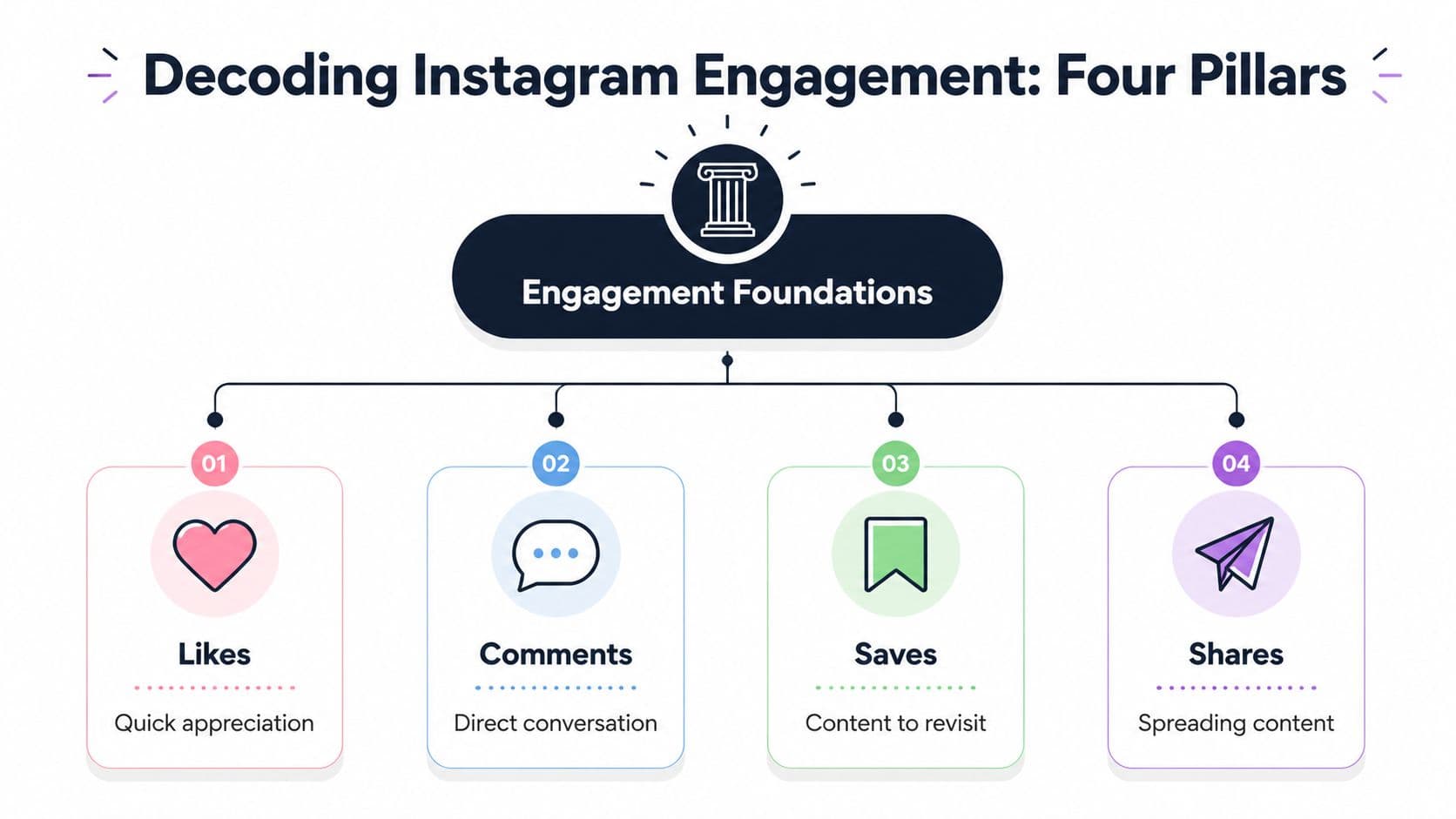
The icons under a post are Instagram's feedback system. For creators, they also work like four different audience promises. A like says, "I saw this." A comment says, "I have something to add." A share says, "This fits someone else too." A save says, "I want access to this again."
That difference shapes strategy.
The heart is the fastest reaction. It asks for almost no effort, which is why likes are common. They are useful for spotting quick appeal, strong visuals, or a good opening hook.
The speech bubble is a stronger sign of involvement. Someone has to pause, form a thought, and type it out. If you want more comments, give people a lane instead of a blank page. "Thoughts?" is broad. "Which cover would you choose?" gives people an easy entry point.
The paper airplane means share or send. This icon points to social utility. People use it when a post helps them say something, teach something, recommend something, or make another person laugh. If your post earns shares, it is traveling beyond the people who already follow you.
The bookmark means save. Creators often underrate this one because it is private, but private actions can reveal strong intent. Saves usually show up on content with shelf life. Tutorials, before-and-after breakdowns, swipe files, checklists, caption formulas, and clear educational carousels tend to perform well here.
A simple way to read these signals:
A save is often a future return visit.
That is why useful posts can keep working long after the first burst of reach. Pretty content attracts attention. Useful content earns a second look. The strongest posts do both.
If your content has an educational or community angle, this article on how churches deepen discipleship with Instagram is a useful example of measuring success by audience behavior, not just visible applause.
Likes feel good because they are public and immediate. Saves and shares are better clues for growth because they point to memory and recommendation.
A save means your post solved a future problem. A share means your post matched a conversation someone was already having in their head. That is a strong creative filter to use before you publish.
Ask four sharper questions before posting:
Creators can take a more strategic approach with Trendy. If a topic keeps showing up in your niche, do not just copy the trend. Turn it into a format people can revisit or pass along. Trend signals attention. Saves and shares turn that attention into momentum.
If you want a clearer read on which themes keep earning taps, exits, replies, and re-watches, learning to read Instagram Stories analytics gives you an early signal before a feed post fully proves itself.
Around profile pictures, Instagram uses color to show Story status. A pink and yellow gradient ring means there is a new, unviewed Story. A grey ring means you have already watched it.
That color shift changes behavior more than many creators realize. The bright ring acts like a fresh sign on a shop window. It tells people something new is available right now. The grey ring removes some of that urgency because the update is no longer new to that viewer.
For creators, the lesson is practical. Stories are built for freshness. Feed posts are built for staying power. Used together, they can do different jobs in the same campaign. A Story can warm up attention, test a message, or tease a post. Then the post can carry the deeper idea.
Use Stories when you want quick reactions, behind-the-scenes context, limited-time reminders, or direct replies. Use feed posts when you want saves, shares, profile visits, and a piece of content that keeps working after the day ends.
The ring is not decoration. It is Instagram's version of a blinking porch light. It tells your audience, "Something new is here."
The symbols inside Story and Reel creation are where Instagram stops being a gallery and starts acting like a workshop. This is the part many creators overlook because the tools look playful, almost optional. They aren't.
A sticker is a prompt. A prompt invites action. Action creates interaction. Interaction teaches you what your audience cares about.

The Poll sticker is one of the easiest interaction tools on Instagram. It lowers the effort for your audience. They don't need to type. They just tap. That's useful when you want quick feedback on preferences, product directions, content angles, or simple audience habits.
The Quiz sticker adds a game element. It works well when you teach, entertain, or want followers to spend a little more attention with you. It also helps you package educational content in a lighter way.
The Q and A sticker invites open response. This one is better when you want language, not just votes. It can uncover objections, confusion, and the exact wording people use to describe their situation.
The Link sticker is direct. It moves attention off the Story and toward a page, product, article, offer, or signup.
Different stickers fit different goals:
| Sticker | Best for | What it reveals |
| Poll | Fast audience choices | Preference patterns |
| Quiz | Playful education | Interest and recall |
| Q and A | Richer audience input | Questions and wording |
| Link | Action beyond Instagram | Click intent |
Creators often ask which sticker performs best. That isn't the most useful question. The better question is what kind of response you need.
If you're deciding between two Reel ideas, use a poll. If you're warming up a launch, use Q and A. If you're teaching and want retention, try a quiz. If you want traffic somewhere else, use a link.
A simple example makes this clearer.
A food creator could post:
Same audience. Four different symbols. Four different jobs.
One useful habit: Match your sticker to the type of decision you're trying to make, not to what feels trendy that day.
Beyond stickers, Instagram's creation symbols affect pacing and style. Text tools help with clarity. Music shapes mood. Effects can add personality if they support the idea instead of distracting from it. Drawing tools, GIFs, and visual overlays can make content feel casual and alive.
The trap is using every tool because it's there. More icons do not automatically mean better content. Too many extras can make a Story feel noisy. A clean Story with one clear interactive element usually beats a cluttered one.
If you're experimenting with polls specifically, this walkthrough on how to do poll on Instagram is a practical place to start.
Instagram frequently refreshes effects, AI-assisted visual tools, and editing features. It's tempting to chase novelty for novelty's sake. Sometimes that works for entertainment accounts. Most creators grow faster when they use new tools only if the tool makes the idea easier to understand, more fun to join, or more likely to be remembered.
Use the tool as a wrapper, not the main event.
A strong creator instinct sounds like this: “Does this sticker or effect help my audience respond faster, think deeper, or act more clearly?” If the answer is no, skip it.
You open Instagram to post a Story, and before you publish anything, the app is already giving you signals. A blue check changes how new visitors read your profile. A green Story ring tells a smaller group, "this is for you." A grey ring tells you someone has already seen what you shared. These symbols are less about design and more about audience control.
For creators, that matters. Growth gets easier when you know who can see what, who can contact you, and which parts of your audience are warming up versus tuning out.
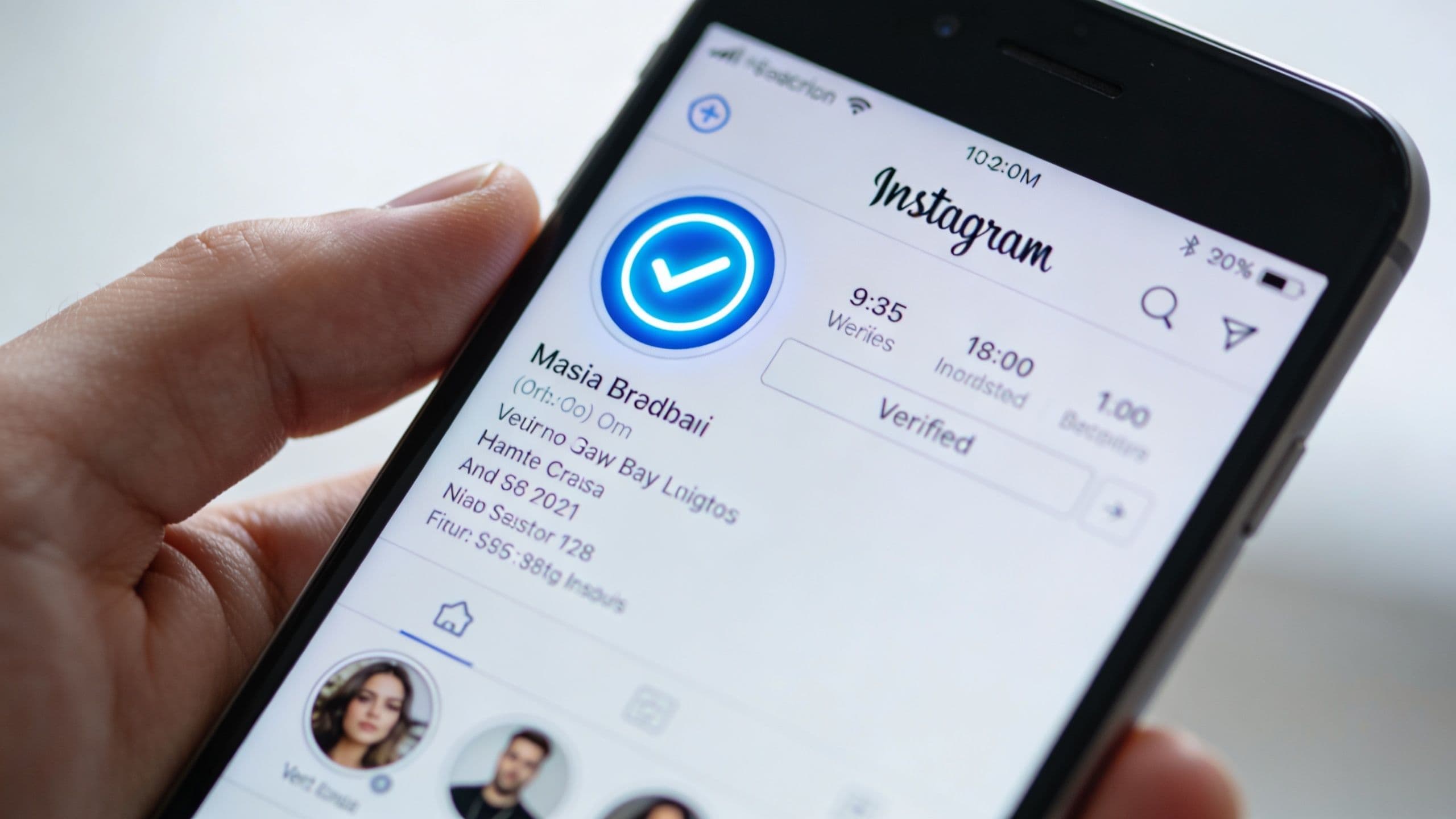
The blue verified badge tells people Instagram has confirmed the account is authentic. For a creator, that symbol works like a trust shortcut. Someone discovering your profile has one less reason to hesitate, especially if your name is common, your niche is competitive, or copycat accounts exist.
Verification does not make weak content perform better. It does make first impressions cleaner, which can improve profile visits, follows, and replies from people who were unsure whether the account was real.
The Close Friends indicator plays a different role. You will usually spot it through a green Story ring or other green visual cue. It marks content shared with a selected list instead of your full audience. That makes it useful for testing ideas before you publish them widely.
Creators often use Close Friends for:
A smart way to use this feature is to treat it like a private studio, not a VIP badge you hand out randomly. Share content there when you want stronger feedback, softer selling, or a more honest conversation. If the replies are lively, that topic may deserve a Reel, carousel, or full campaign later.
These symbols and settings are really audience filters. They help you protect your attention the same way editing tools help you protect a visual style.
| Tool | What it does | Best use case |
| Mute | Hides someone's posts or Stories from your view | You want less noise without creating tension |
| Restrict | Limits how someone interacts with you in a low-visibility way | Someone keeps pushing boundaries in comments or DMs |
| Block | Removes access to your profile and content | You need a firm safety boundary |
Mute is the lightest option. Use it when an account is cluttering your feed, distracting you, or pulling you into comparison mode.
Restrict helps with community management. Comments from a restricted account become less disruptive, and the person is less likely to realize you changed anything. That makes it useful for handling friction without turning a small issue into a bigger one.
Block is simple. If someone is harassing you, scraping your content, or making Instagram feel stressful, block them.
A lot of creators treat these tools as social etiquette questions. They are really workflow tools. Protecting your mental bandwidth protects your consistency, and consistency is part of growth.
The colored Story ring and the grey ring also tell you something useful about attention. A pink and yellow gradient usually means there is a new Story to watch. A grey ring means you have already viewed it.
That small visual difference matters because Story engagement is time-sensitive. Fresh Stories usually get the most immediate attention, and older ones lose momentum as your audience keeps scrolling. If your Stories regularly get quick views and replies, your posting rhythm is probably lining up with your audience's habits. If the response comes late or stays flat, timing may be part of the problem.
Symbols become strategic. The ring is not just telling you whether content is new. It is giving you a clue about how quickly your audience reacts, which topics they prioritize, and whether your core viewers are trained to check in when you post.
If you are still defining who those viewers are, this guide on how to find your target audience on Instagram will help you connect these account signals to a clearer content plan.
At some point, Instagram stops feeling like an app you use and starts feeling like a system you manage. That's when the advanced symbols matter. These are the labels, arrows, counts, and tags that tell you whether attention is growing, flattening, or turning into income.
The good news is that most of them sound more intimidating than they really are.
Inside Instagram Insights, two terms confuse people constantly: reach and impressions.
Reach means the number of distinct accounts that saw your content. If one person sees your post once, that counts as one reached account.
Impressions means the total number of views, including repeat views from the same person. So if one person sees the post multiple times, impressions go up while reach may stay the same.
That difference matters because each metric answers a different question:
If reach is decent but impressions are much higher, your content may be getting repeat views from the same group. That can be good when the content is sticky. If reach is low and impressions are low, the issue may be packaging or distribution. If reach is high but engagement feels weak, the content may be getting exposure without enough depth.
The labels accounts reached and accounts engaged are useful for the same reason. The first tells you who saw. The second tells you who interacted.
You may also see little up or down arrows beside metrics. These aren't magic predictions. They're simple directional cues. They tell you whether a result is moving better or worse compared with a prior period shown in the app.
Don't obsess over one arrow. Read groups of signals together.
For example:
That kind of reading turns Insights into decisions instead of decoration.
If a metric rises, ask why. If a metric falls, ask what changed in the post format, timing, hook, or audience relevance.
Instagram's engagement system is built around the core actions people can take on a post. As noted earlier, likes, comments, saves, and shares feed into the platform's analytics structure. The same Instagram Insights source explains that engagement rate is commonly calculated as likes plus comments divided by followers, and rates above 1 to 3% are generally considered strong for most accounts in that framework.
That's useful as a reference point, not a verdict.
A creator with a small, tight audience may see stronger conversation. A broader entertainment account may get tons of views and lighter interaction. A tutorial page may earn more saves than comments. The symbol mix matters as much as the headline number.
Instagram also uses symbols and labels to mark monetization paths. These often include things like the Paid Partnership label, a subscription-related star, or a gift icon on eligible Reels and creator surfaces.
Even when those icons look small, they signal a big shift. They tell your audience, brands, and Instagram that your account isn't only publishing content. It's participating in an economy.
Here's the practical reading:
| Symbol or label | What it signals | Why it matters |
| Paid Partnership | Sponsored relationship | Transparency and brand trust |
| Subscription star | Exclusive member content | Recurring audience value |
| Gift icon | Direct fan support | Creator earning potential |
These symbols don't create income by themselves. They mark the paths where audience trust, niche clarity, and consistent content can turn into revenue.
If you're working toward that stage, this guide on how to monetize an Instagram account is a helpful companion.
A casual user sees an icon and thinks, “What does this button do?” A creator eventually starts asking, “What behavior does this icon encourage, and what does that tell me about my audience?”
That's the mindset shift.
A save icon points toward durable value. A share icon points toward social currency. A Story ring points toward urgency. A paid partnership label points toward trust and disclosure. An up arrow in Insights points toward a change worth investigating.
When you read Instagram that way, the app becomes less mysterious. It becomes legible.
Once you see Instagram's symbols for what they are, the app gets calmer. The house sends you to your feed. The magnifying glass opens discovery. The heart, comment bubble, share icon, and bookmark reveal how people value your content. Story rings show freshness. Stickers invite participation. Badges and controls help you manage trust and boundaries. Insights symbols tell you whether your work is spreading or stalling.
That's the definitive answer to what do the symbols on instagram mean. They mean action. They mean intent. They mean opportunity.
The creators who grow steadily usually don't treat Instagram like a mystery box. They treat it like a control panel. They notice what each symbol is asking for, then they build content that fits the behavior behind it.
If you feel overwhelmed, simplify your next week of posting around three questions:
A tutorial post should earn saves. A funny relatable post should earn shares. A thoughtful opinion should invite comments. A Story should feel timely enough to tap while the ring is still fresh. A Close Friends Story should feel genuinely closer, not recycled.
That mindset turns scattered posting into deliberate creation.
You don't need to memorize every icon overnight. You just need to stop ignoring what the app is telling you. Every symbol is a cue. Every cue is a choice. And every choice shapes how people experience your work.
If you're ready to stop guessing and start posting with a clearer strategy, Trendy can help turn Instagram signals into action. It gives creators personalized content ideas, trend insights, posting guidance, and performance direction for what to publish next. You can get the app on iOS or Android and build a smarter plan around the content you're already making.
