You clean up your grid, polish your bio, and then Instagram greets new visitors with a row of random Story circles pulled from old posts, blurry screenshots, and one accidental close-up of your coffee. That’s the moment highlight covers for instagram stop being a cute extra and start becoming a profile problem.
Most creators treat highlights like storage. Strong profiles treat them like navigation.
A good set of covers tells people where to tap first. It also makes your profile feel intentional before anyone reads a caption. If you’re a creator, coach, shop owner, or service business, that split-second clarity matters more than people admit.
A visitor lands on your profile, glances at your bio, and then their thumb hovers over your highlight row. That tiny strip does more sales work than a lot of creators realize.
Instagram turned highlights into a permanent profile feature on May 23, 2017, when Story Highlights launched globally alongside Stories reaching 200 million daily active users, according to Snappa’s recap of Instagram highlight covers. From that point on, Stories stopped being purely temporary. They became reusable profile assets.
That placement matters. Highlights sit in prime real estate, above the grid and directly under the bio, so they influence what people tap before they ever see your best post.
Covers are built on a 1080 x 1920 pixel canvas in a 9:16 aspect ratio, but Instagram shows them as circular crops. Good covers account for that by keeping icons and text centered. The first few circles also get the most attention because people scan profiles fast.
That is why weak covers cost more than people think.
A messy highlight row creates friction right at the moment someone is deciding whether you look credible, current, and worth exploring. A clean set does the opposite. It gives structure to your profile and makes the content inside feel easier to trust.
Your highlights should answer the silent questions a visitor has: Who are you, what do you do, and where should I tap next?
I’ve seen creators post strong tutorials, great client wins, and useful FAQs, then bury all of it under mismatched covers pulled from random Story frames. The content was solid. The presentation made it look careless.
| Approach | What people feel |
| Matching covers with clear categories | Organized, credible, worth exploring |
| Auto-generated covers from random Stories | Cluttered, unfinished, harder to trust |
| Icons that match the topic | Fast to scan |
| Tiny text or mixed visual styles | Confusing at a glance |
Covers also do a job your feed cannot do as efficiently. They sort your best proof into clear paths. Testimonials, services, product demos, tutorials, FAQs, and results become easy entry points instead of scattered posts people have to hunt for.
That matters for brand positioning. If your profile identity still feels scattered, this guide on how to build a social media brand pairs well with a highlight cleanup.
There’s also a practical upside for non-designers. You do not need a branding team to make this look polished. You need a short list of categories, a simple visual system, and a way to spot what audiences already respond to. That’s where Trendy earns its keep. It helps you use trend signals and content patterns to choose covers that are not just pretty, but aligned with what people want to tap.
If you use AI image tools to create icons or backgrounds, keep readability ahead of novelty. The style battle in tools like Ideogram vs Midjourney is interesting, but on Instagram, clarity usually beats intricate art once everything gets shrunk into a circle.
The biggest mistake isn’t ugly covers. It’s saving the wrong content.
A polished icon set won’t rescue weak categories. If the buckets don’t match what your audience wants, your highlights become a well-designed junk drawer.
Every highlight should do one of three things:
If a category doesn’t serve one of those jobs, it probably doesn’t deserve a front-row circle.
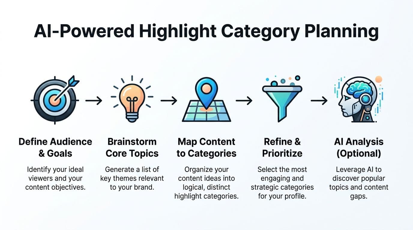
Don’t brainstorm in a vacuum. Look backward before you design forward.
Review your archive and ask:
AI can help here. Instead of manually sorting through dozens of Stories, use account-level pattern spotting to identify recurring themes, best-performing topics, and content gaps. If you’re already experimenting with machine-assisted planning, this article on AI for social media content creation is worth reading.
Practical rule: Don’t make a highlight because it sounds normal. Make it because a visitor would tap it.
Before you commit to a highlight, run it through this filter:
| Question | Keep it if the answer is yes |
| Is this useful to a new visitor? | It helps someone understand or trust you |
| Do I have enough Story content to support it? | It won’t look empty after a week |
| Does it match a business or creator goal? | It supports discovery, trust, or action |
| Is it distinct from another highlight? | It won’t create overlap and confusion |
For most profiles, the cleanest setup is a tight set of categories with clear purpose. Broad enough to grow, specific enough to scan.
Examples that usually work well:
This matters if you’re generating assets with AI. The style needs to match the category logic.
If you’re deciding which image generator fits your workflow, the comparison in Ideogram vs Midjourney is useful because it helps you think through text handling versus more artistic output. For highlight covers, readability usually wins over visual drama.
A category should be obvious before someone taps. If it needs explanation, rename it.
Someone lands on your profile, sees six Highlight circles, and decides in a second whether your account feels organized or homemade. That judgment is not superficial. Clean covers make your profile easier to scan, and easier profiles get tapped more.

The good news is that polished does not mean complicated. It means consistent.
Use a 1080x1080 pixel canvas. Lovart’s highlight cover design guide recommends that format because it gives you enough room to center icons cleanly for Instagram’s circular crop.
I also keep the design system intentionally small. The more options you introduce, the faster the set falls apart. Pick these four things once and reuse them across every cover:
That is the part many non-designers skip. They hunt for prettier assets; the solution lies in stricter repetition.
Let AI help you choose a style that fits your profile. Trendy saves time by allowing you to check what visual patterns are already performing in your niche before designing covers. If creators in your space are getting traction with clean monochrome icons and restrained type, copying a loud scrapbook style just because it looks fun is usually the wrong move.
Highlight covers are small. They need to read fast.
I use Trendy to spot whether my niche is trending toward soft neutrals, bold contrast, serif labels, icon-only systems, or more editorial layouts. Then I build covers that fit my brand without drifting too far from what people already recognize. That is the trade-off. Originality matters, but clarity matters more on a profile screen.
A free editor is enough. Canva works. Adobe Express works. Any basic app with shape, color, and icon tools works.
Use this workflow:
If you want templates, use them carefully. Good templates save time. Bad template habits make your profile look borrowed. Change the color palette, swap the icon family, and remove decorative extras that do not survive the tiny circle view.
Color choice should match both your brand and the kind of trust you want to build.
| Style | Best for |
| Black and white | Editorial, fashion, minimalist creators |
| Warm neutrals | Lifestyle, wellness, handmade brands |
| Bright brand colors | Coaches, product brands, energetic creators |
| Muted pastels | Beauty, personal brands, soft aesthetic niches |
If your brand has no established palette yet, start with one main color and one neutral. That gives you enough structure without turning the row into a rainbow.
Typography needs even more restraint. If you want a shortcut, this guide to best fonts for Instagram is useful because it focuses on readable options that still feel branded. In practice, icons usually outperform text on Highlight covers because the viewing size is so small.
Icons should be painfully obvious. A bag for products. A chat bubble for FAQs. A camera for behind the scenes. A star for reviews. If a symbol needs explanation, replace it.
I see the same problems over and over:
One quick rule helps here. If someone new to your profile cannot guess what a Highlight contains before tapping, the cover is not doing its job.
A quick walkthrough can help if you want to see the mechanics in action:
I have tested flashy covers, illustrated covers, text-heavy covers, and ultra-minimal covers. The winners are usually the simplest set that matches the profile and stays consistent across every category.
Good highlight covers for instagram do not need to impress designers. They need to help visitors understand your account fast, trust what they see, and tap the right Highlight.
Design is only half the job. The second half is getting those covers onto your profile without creating extra mess.
Instagram’s process is simple once you know where to tap. Most frustration comes from trying to do everything in the wrong order.
Do this in sequence:
From your profile, tap the New circle under your bio or create one from archived Stories. Select the Stories you want, tap next, add the title, then edit the cover from your photo library.
If you only need to update the art on an existing highlight, open that highlight and go into the edit options. Change the cover there rather than rebuilding the whole category.
Keep names short. One word is often enough. Two is fine. Long labels get clipped and lose their punch.
Here’s what usually works best in practice:
If you post Stories often and want a smoother archive-to-highlight flow, keeping your Story process organized helps. This article on how to share a story on Instagram is a good refresher if your publishing habits need tightening up.
If your uploaded cover appears off-center, the issue is usually one of these:
| Problem | Fix |
| Icon looks cut off | Move the icon closer to center in the original file |
| Design feels tiny | Scale the main element up before exporting |
| Cover looks blurry | Re-export a clean file and avoid screenshots |
| Row feels chaotic | Rebuild as a matching set, not one by one |
Most “Instagram ruined my cover” complaints are really “the design wasn’t made for a circular crop.”
Highlights aren’t static branding pieces. They’re living shelves on your storefront.
A cover set can look beautiful and still underperform if the categories are stale, the content inside is outdated, or the profile no longer reflects what you make.
Open your profile and look at it cold. Better yet, hand your phone to someone who doesn’t know your brand well and ask what they think each highlight contains.
If they hesitate, your system needs work.
Use this quick audit list:
This happens a lot. A highlight starts as “Tutorials” and slowly becomes a mixed bag of tips, life updates, product announcements, and random reposts.
That drift confuses visitors. It also weakens trust because the promise on the cover no longer matches the content inside.
When a highlight drifts, you have three good options:
Trend-aware highlights can be smart. Reactive clutter is not.
If a new topic in your niche keeps appearing in your Stories, turns into repeat questions, or becomes part of your content rhythm, that’s a good reason to create a new highlight. If it’s only a passing fascination, leave it in Stories and keep your permanent row clean.
A highlight earns permanence when the topic still makes sense after the buzz wears off.
This is also where scheduling discipline helps. If your Stories are chaotic, your highlights will become chaotic by default. Building a repeatable archive starts with a repeatable publishing habit, and this guide on how to schedule Instagram Stories can help tighten that side of the workflow.
You don’t need a rebrand to update your covers. Refresh when:
| Signal | Meaning |
| Your offers changed | Your categories probably should too |
| Your visual style evolved | Old covers may now look disconnected |
| You added new content pillars | New buckets may deserve a place |
| Existing highlights overlap | Visitors need cleaner navigation |
| You cringe when you see the row | Trust your instinct and fix it |
The best profiles treat highlights like curated top shelves, not storage bins. Every circle should either guide, reassure, or convert.
Good highlight covers answer small but important profile questions fast. These are the ones creators ask me most often.
Keep enough to guide a new visitor in a few seconds.
For most profiles, that means a tight set of categories with clear jobs. If two highlights cover similar ground, merge them. A shorter row usually performs better because people can scan it without hesitation.
Yes. Open the highlight, tap Edit Highlight, then Edit Cover, and upload an image from your camera roll.
This is the easiest way to keep covers polished while your public Stories stay focused on current content.
Not directly. Instagram does not give you a simple drag-and-drop option.
In practice, highlight order shifts when you update a highlight, so the cleanest workaround is to refresh the ones you want closer to the front. If profile conversion matters, keep your sales, proof, or start-here highlights actively maintained.
Icons usually scan faster. Text works when it is very short and easy to read at a tiny size.
The safest setup for non-designers is simple icon covers paired with clear highlight names underneath. That gives you visual consistency without forcing the cover itself to do all the explaining.
You do not need design training to make covers that look sharp.
Use one background color, one icon style, and one framing rule, then repeat it across every cover. That system matters more than artistic skill. If you want to speed up the planning side, Trendy helps by showing which content pillars are already pulling attention in your niche, so you can build covers around categories that deserve permanent space instead of guessing.
Start with the categories that answer your biggest visitor questions and support your profile goal.
A strong first set often includes:
If you are a creator or small business owner, that mix gives new visitors context, proof, and a next step.
Yes, they can.
Old branding, expired offers, and random Story leftovers make the profile feel neglected. Every highlight should either guide, reassure, or help someone take action. If it does none of those, archive it, combine it, or rebuild it with a cleaner cover and a clearer purpose.
Trendy turns profile guesswork into a strategy. If you want help spotting what content pillars are already working, what topics are gaining traction in your niche, and what to post next so your future highlights stay useful, try Trendy. It’s available on iOS and Android.
