
SEO Title: How to Make an Instagram Carousel That Drives Saves, Shares, and Repeat Views
Meta Description: Learn how to make an Instagram carousel that gets saved. Use a proven slide structure, better hooks, mobile-first design, and smarter CTAs.
Most advice on how to make an Instagram carousel starts with fonts, colors, and templates. That's backwards. Carousels win because people save them. Metricool's 2026 study covering 24,364,803 posts across 375,118 accounts found that carousels generated roughly 9 times more saves than static image posts, which is why they're still one of the sharpest formats for educational content, checklists, myth-busting, and step-by-step posts (Flockx summary of Metricool 2026).
If your idea is something people will want to revisit later, make it a carousel. If it depends on motion, sound, or personality in the first second, make it a Reel. That's the decision.
Why Carousels Still Win on Instagram in 2026
Instagram carousels are not just “engagement posts.” They're retention posts. People swipe, pause, reread, save, and come back later. That behavior matters more than polished graphics.
The benchmark most creators should care about is simple. SocialInsider's 2026 benchmark shows carousels remained Instagram's strongest organic format by follower-based engagement, averaging 0.50% in Q2 2026, compared with 0.48% for Reels and 0.33% for single-image posts. It also showed a slight dip from 0.52% in Q1 2026 to 0.50% in Q2, which still leaves carousels in the lead as overall engagement softens a bit (benchmark summary).
That's why serious operators still use carousels to teach, position expertise, and stay visible longer than the first posting window.
Pick the format based on the outcome
Creators keep asking the wrong question. It's not “Should I post more Reels or carousels?” It's “What do I need this post to do?”
Use this rule:
- Choose a carousel when the post is a list, tutorial, myth-bust, checklist, framework, before-and-after, or FAQ.
- Choose a Reel when the post depends on movement, reaction, tone, trend participation, or a fast emotional hit.
- Choose a single image only when one visual can carry the whole message on its own.
A useful way to build authority on Instagram is to stop treating every idea like a video. Some ideas deserve a swipeable format because the payoff happens through progression, not spectacle.
| Format | Avg Reach Multiplier | Save Rate | Best Use Case |
| Carousel | Qualitatively strong for retention-heavy posts | Strongest for reference-style content | Tutorials, checklists, lists, educational breakdowns |
| Reel | Often stronger on raw reach | Usually weaker when the content isn't reference-worthy | Trends, quick takes, personality, sound-led moments |
| Single Image | Lowest staying power | Weak for save behavior unless the visual itself is highly useful | Announcements, quotes, simple brand visuals |
Structure beats novelty
Another 2026 benchmark found carousels at 0.55% engagement overall and 0.50% in Q2 2026, slightly ahead of Reels and single-image posts. A separate analysis of 52 million posts reported 6.90% median engagement rate by reach for carousels versus 3.31% for Reels, which tells you something important. Carousel performance depends heavily on structure and audience fit, not just format choice (SocialInsider Instagram benchmarks).
If you're also deciding between swipe posts and video, this breakdown of different video formats helps sort ideas before you create the wrong asset.
Carousels don't need cinematic polish. They need a reason to keep swiping.
The Slide-by-Slide Structure of a Carousel That Saves
Bad carousels try to say everything on every slide. Good carousels assign one job per slide.
The cleanest structure is a five-part sequence. Even if you use more than five slides, keep these jobs intact.
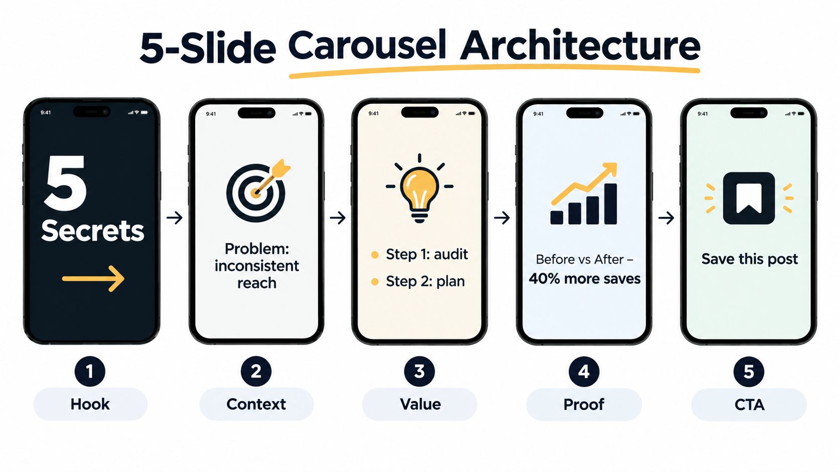
Slide 1 is the hook
This slide earns the first swipe. If it doesn't create tension or promise a payoff, the rest of the carousel doesn't matter.
Keep the main promise brutally short. Five words is often enough.
Examples:
- Stop posting weak hooks
- 7 pricing mistakes freelancers make
- Why your Reels don't convert
- The carousel formula that gets saved
Don't add your logo. Don't ask for a follow. Don't waste the top half on branding.
Slide 2 gives context
Now tell people why this matters and who it's for. Weak creators start rambling. Don't.
A strong second slide does one of three things:
- Names the audience
- Frames the problem
- Clarifies the outcome
Example: “For creators stuck between decent reach and low saves, this fixes the structure problem.”
That's enough. You're not writing a landing page.
Slides 3 through the second-to-last slide deliver the payload
Each payload slide should hold one idea only. Not three. Not a paragraph with tiny type. One idea.
Use this mini structure:
- short headline
- one or two lines of explanation
- one visual cue, screenshot, icon, or simple example
If your carousel is “5 mistakes killing your saves,” then mistakes 1 through 5 each get their own slide. Clean. Predictable. Easy to finish.
For creators looking for fresh concepts before writing, this list of top Instagram carousel ideas for creators in 2026 is a good prompt bank.
Practical rule: If a slide needs a voiceover to make sense, it isn't carousel-ready yet.
The second-to-last slide proves it
Show evidence, an example, a before-and-after, a screenshot, a rewritten hook, or a clearer version of the point.
You don't need a giant case study. You need a concrete illustration.
For example:
- weak hook vs stronger hook
- cluttered slide vs cleaner slide
- generic CTA vs save-worthy CTA
- old post concept vs revised carousel angle
The final slide tells people what to do
Recap the point. Give one action. Ask for the right behavior.
A solid final slide usually includes:
- the main takeaway
- one next step
- a save or share CTA
Example: “Use one promise, one idea per slide, one clear CTA. Save this before your next content batch.”
This structure works because every swipe resolves one question and opens the next one. That's how you make an Instagram carousel people finish, save, and revisit.
Sizing, Fonts, and Mobile-First Design Rules
Most carousel design advice is still too aesthetic and not practical enough. Your slide is competing with thumb speed, glare, bad lighting, and a tiny screen. Design for readability first.
For feed carousels, the safest default is 1080 × 1350 px in a 4:5 portrait format, which remains the most broadly recommended, highest-visibility option for feed real estate (ContentDrips format guide). Some workflows now support 1080 × 1440 px in a 3:4 portrait format, but most guidance still treats 1080 × 1350 as the default because it's the safest cross-device choice for engagement-focused posts (Wavegen carousel guide).
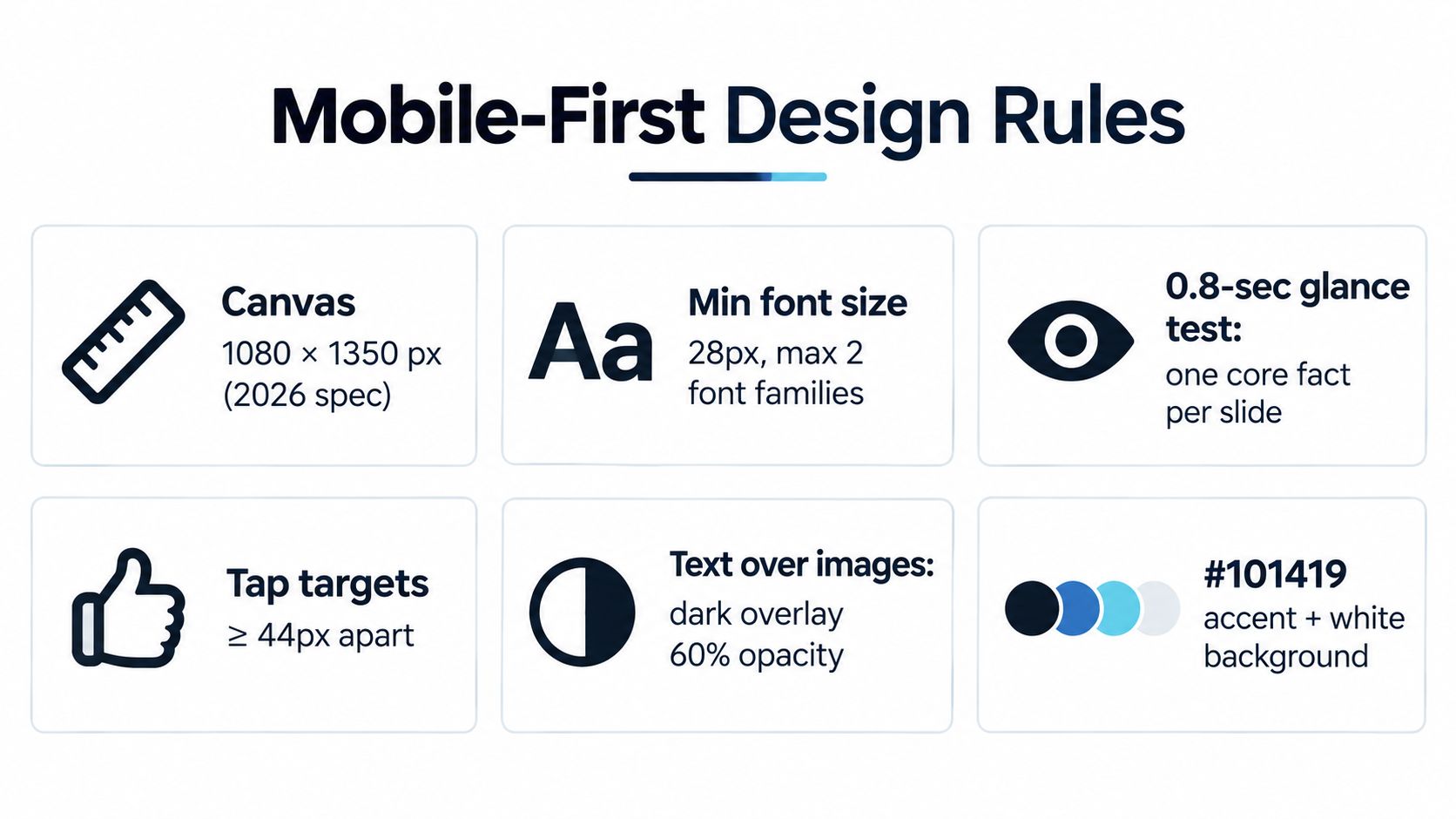
Readability rules that matter more than style
Use one font family per carousel. Two if you're disciplined. More than that and the post starts looking like a Canva accident.
Keep these rules tight:
- Headline first: Make the headline visually dominant.
- Bold contrast: Dark text on light backgrounds or light text on dark backgrounds. Don't get clever.
- Short copy: Aim for roughly 30 words or fewer per slide.
- Consistent layout: Put headlines in the same zone across slides so the brain doesn't keep reprocessing the layout.
The older habit of cramming every takeaway onto one card needs to die. A carousel is a sequence, not a screenshot of your notes app.
Design for small screens and mixed audiences
If your audience includes international readers, leave extra vertical space so translated copy doesn't break the slide. Also avoid wrapping text around product shots or decorative shapes. That layout usually collapses on smaller phones.
A practical reference for evolving platform specs beyond Instagram is this 2025 social media dimensions guide. It's useful if you repurpose the same post for other networks.
Before you publish, run this three-step check:
- Arm's-length test: Can you read every slide on your phone without zooming?
- Contrast test: Does the text still read clearly in low brightness?
- Translation test: Would a longer phrase still fit without wrecking the layout?
If you need tools to build the visual side faster, these apps to make Instagram posts are a solid starting stack.
Hook Formulas for Slide 1 That Stop the Scroll
Slide 1 is a contract. In under two seconds, it has to tell the viewer what they'll get by the last slide. If that promise is muddy, your carousel dies early.
The best hooks usually do one of three things. They promise an outcome, call out a specific audience, or create tension.
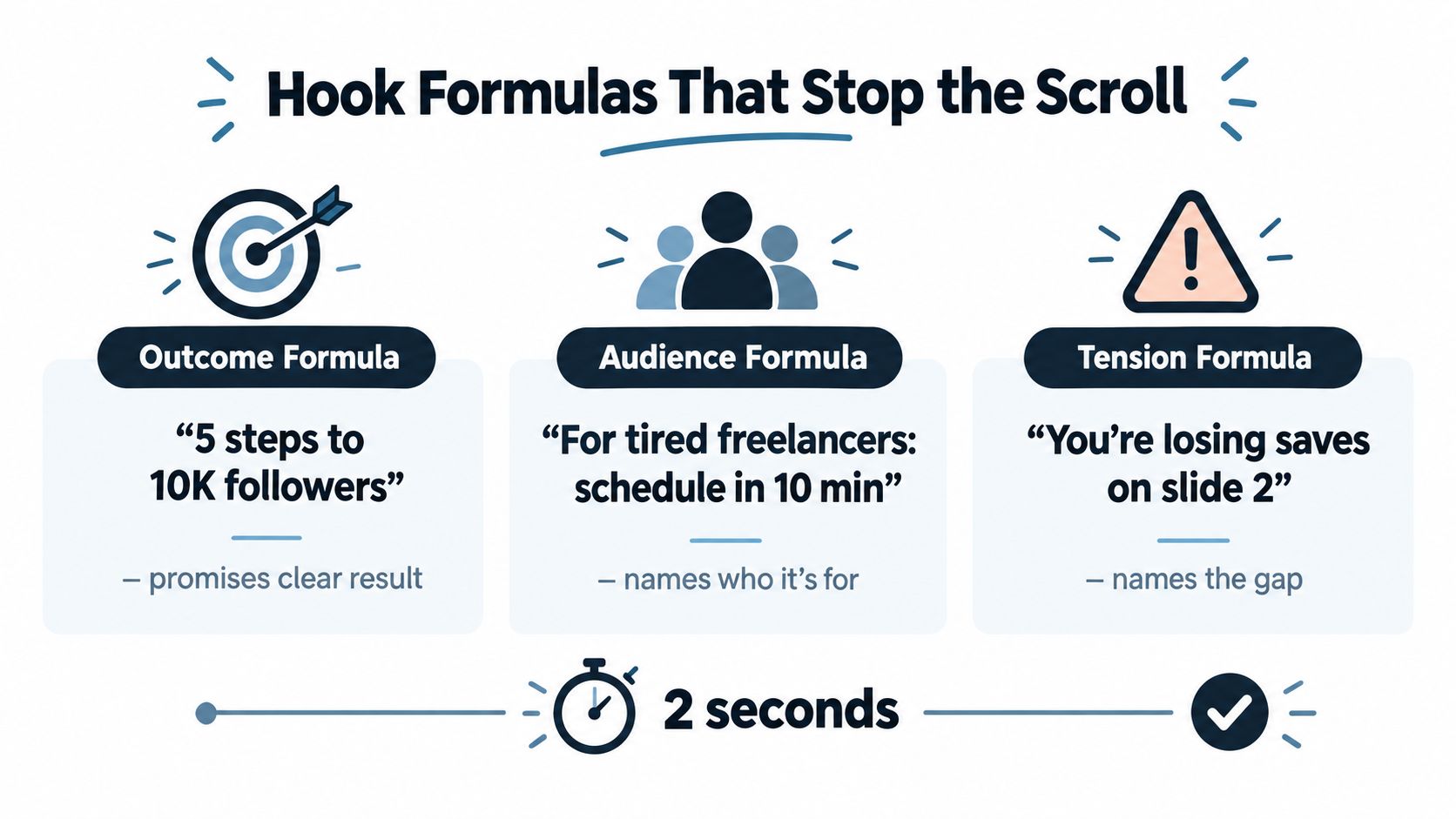
Five formulas worth reusing
- Curiosity gapTemplate: What [group] knows about [topic] that you don'tExample: “What top coaches know about client retention that most trainers miss”This works when the audience already feels there's an inside game. It underperforms if the topic is too broad.
- Mistake frameTemplate: Stop doing [common action] if you want [outcome]Example: “Stop posting random feature updates if you want SaaS users to care”This is sharp because it names the mistake up front. It fails when the accusation feels generic.
- Numbered promiseTemplate: [N] [items] that [verb] your [metric]Example: “5 budgeting habits that clean up your cash flow”This is still one of the most reliable formats for personal finance, creator education, and B2B tips.
Here's a solid video breakdown if you want to study hook writing in motion before scripting your own first slide:
- Contrarian takeTemplate: Unpopular opinion: [bold claim]Example: “Unpopular opinion: your brand doesn't need more content, it needs fewer formats”Use this when you can defend the claim. Empty controversy gets swiped past.
- Before-and-after bridgeTemplate: From [bad state] to [desired state] in [timeframe]Example: “From inconsistent posting to a clean weekly system in one work session”This is strong for fitness, productivity, and business workflows. It gets weak when the transformation sounds made up.
Don't put a logo, “follow for more,” or any other extra ask on slide 1. The only job is winning the swipe.
If you want more swipe-stopping templates, this guide on how to write hooks is worth bookmarking.
Caption Strategy and CTAs That Match Your Goal
Captions are not decoration. They do the part your slides shouldn't have to do. That means context, framing, and the final push.
A good carousel caption usually has three parts:
- a one-line opener that mirrors the hook
- a short body that adds story, nuance, or proof
- a CTA that matches the metric you want
Use a caption that supports the slide stack
If the slides already carry the full teaching, don't repeat them line by line in the caption. Add the piece that didn't fit naturally inside the visuals.
That could be:
- a quick client scenario
- one objection
- a short explanation of why the advice matters now
- a tighter setup for the CTA
For example, if the carousel teaches “5 homepage mistakes for coaches,” the caption can explain which kind of coach this applies to and why those mistakes keep reducing clarity.
Match the CTA to the post's actual job
The final line should fit the content. A lot of posts collapse here. People ask for saves on fluff and ask for comments on reference content that should be saved instead.
| Goal | CTA Pattern | Target Metric | Best Carousel Type |
| Save | Save this for your next [task] | Saves | Tutorials, checklists, frameworks |
| Share | Send this to the friend or teammate who needs it | Shares | Lists, relatable mistakes, team workflows |
| Comment | Reply with your take, A or B | Comments | Opinions, debates, hot takes |
| Profile visit | Comment a keyword and check my profile for the next step | Profile visits | Funnel posts, templates, offers |
Keep the caption clean
A few rules:
- Don't overstuff emojis: A couple is fine. A wall of them kills credibility.
- Don't ask for everything: Save, share, comment, follow, DM, click bio. Pick one primary action.
- Don't force hashtags: Use them only if they support discovery for the niche and topic.
- Don't fake utility: If the post isn't reference-worthy, a save CTA will feel cheap.
A carousel earns saves when the viewer thinks, “I'll need this later.”
This also applies when you repurpose the same idea into LinkedIn posts, Threads/X posts, ready-to-shoot video scripts, or visual post concepts. The CTA has to match the format, not just the topic.
Publishing, Timing, and Measuring Carousel Performance
Most creators don't have a carousel problem. They have a workflow problem. They post randomly, review nothing, then blame the format.
A better system is weekly and boring. That's good. Boring systems publish more.
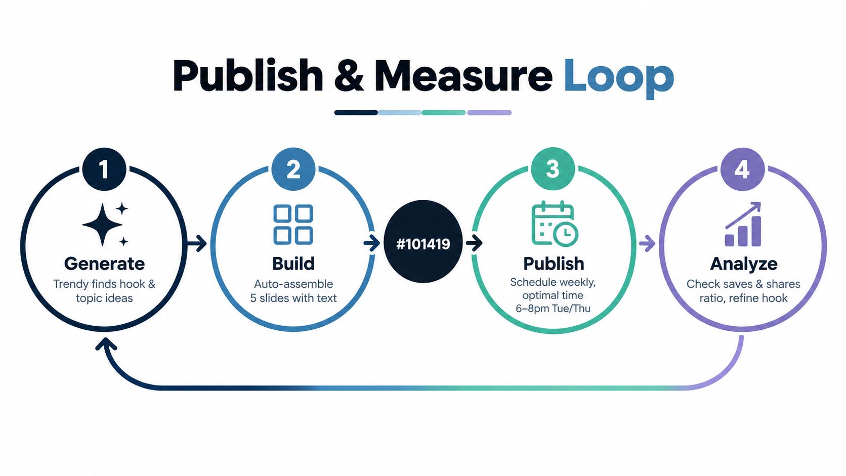
Use a four-step loop
The practical content loop is simple:
- Profile AuditReview what your audience already responds to. Look for posts that got replies, saves, shares, or qualified profile visits.
- Trends and IdeasPull topics from current creator pain points, recurring questions, and proven content formats. Reels vs posts matters. Some ideas should become ready-to-shoot video scripts. Others should become carousels, LinkedIn posts, or Threads/X posts.
- Content CreationBuild the slide outline, write the hook, draft the caption, and package the CTA around the intended action.
- Performance AnalysisCheck what happened, log the pattern, and reuse the winning structure.
That workflow is exactly where a cross-format tool is useful. Trendy analyzes your account, surfaces niche-aware ideas, helps shape hooks and post formats, and supports planning across Instagram, TikTok, LinkedIn, and Threads/X instead of treating content like isolated one-off posts. If you want a better publishing rhythm, start with its iPhone app on the App Store, the Android app on Google Play, or the web app for Trendy.
Measure the right things
You don't need a bloated dashboard. Watch the stack that matches carousel behavior:
- Saves: The headline metric for educational and reference-style carousels
- Reach: Useful as a distribution check, not the whole story
- Profile visits: Good downstream signal for posts that warm up interest
- Slide-depth behavior: Watch where people lose interest
If slide 1 gets attention but slide 2 loses people, your hook overpromised or your context dragged. If reach looks decent but saves stay weak, the content probably wasn't useful enough to revisit.
For creators who publish educational content, the thinking in this social media guide for writers applies well beyond authors. Useful content needs a repeatable system, not bursts of motivation.
A smart scheduling layer matters too. Use your own audience behavior to determine timing instead of copying generic “best time” advice. This breakdown on the best time to post on Instagram for engagement is a good practical reference.
Review on a weekly cadence
Do one review every week.
Pull your top carousel and your weakest carousel. Log three things:
- the hook type
- the topic structure
- the CTA
Then reuse the winner's structure with a new topic. That's how you stop guessing.
Common Carousel Mistakes and Quick Fixes
Most underperforming carousels fail for one of three reasons. The good news is you can usually fix them in under ten minutes.
Weak slide-1 hooks
Symptom: People see the post, but hardly anyone swipes.Cause: The first slide sounds broad, bland, or overdesigned.Fix: Rewrite the first line so it names a sharper outcome, audience, or tension. Keep it shorter. Remove any branding clutter.
Mismatched narrative arc
Symptom: The post starts well, then interest drops hard in the middle.Cause: The slide order is wrong, or too many ideas are crammed into one sequence.Fix: Reorder the deck so each slide answers one question and naturally sets up the next. If one slide carries two ideas, split it or cut one.
Buried or wrong CTA
Symptom: The post gets some reach, but the saves and shares are weak.Cause: You asked for the wrong action, or you asked too early.Fix: Move the CTA to the last slide and match it to the content type. Save CTA for useful reference posts. Share CTA for relatable lists. Comment CTA for opinions.
Quick edit beats full rebuild. Most carousel problems are hook, order, or CTA problems.
Run this yes-or-no check before posting:
- Does slide 1 promise a clear payoff?
- Does slide 2 explain why this matters for a specific person?
- Does each slide hold one idea only?
- Does the final slide ask for one clear action?
- Would I personally save this if I found it in my feed?
If the answer to the last one is no, don't post it yet.
If you want a faster way to turn rough ideas into stronger carousels, Trendy helps you move from Profile Audit to Trends & Ideas, then into Content Creation and Performance Analysis without bouncing between five tools. It's useful when you need more than captions. Think hooks, ready-to-shoot video scripts, slide outlines, visual post concepts, and a cleaner publishing workflow across Instagram, TikTok, LinkedIn, and Threads/X.